2025 – 2026In development

PaySDK: one payment foundation for every Grab product

Every Grab vertical had built its own checkout. I led the design of a shared payment framework that keeps checkout consistent where it matters and flexible where products differ.

My role

Led the end-to-end design: workshops, design direction, UX exploration and UI for PaySDK Prebuilt, Components and P2M integration.

Team

Payments team, with product, engineering and designers across verticals.

Impact

Aims to improve checkout consistency, payment completion and integration speed across Grab.

The challenge

Each vertical had a different checkout

GrabFood, GrabMart, Dine-in, Transport and Grab Unlimited each had their own checkout flow, online and offline.

  • Inconsistent: different flows confused users and eroded trust.
  • Unscalable: legacy designs were built for single use cases.
  • Costly: fragmented systems made every change slow and unpredictable to build.
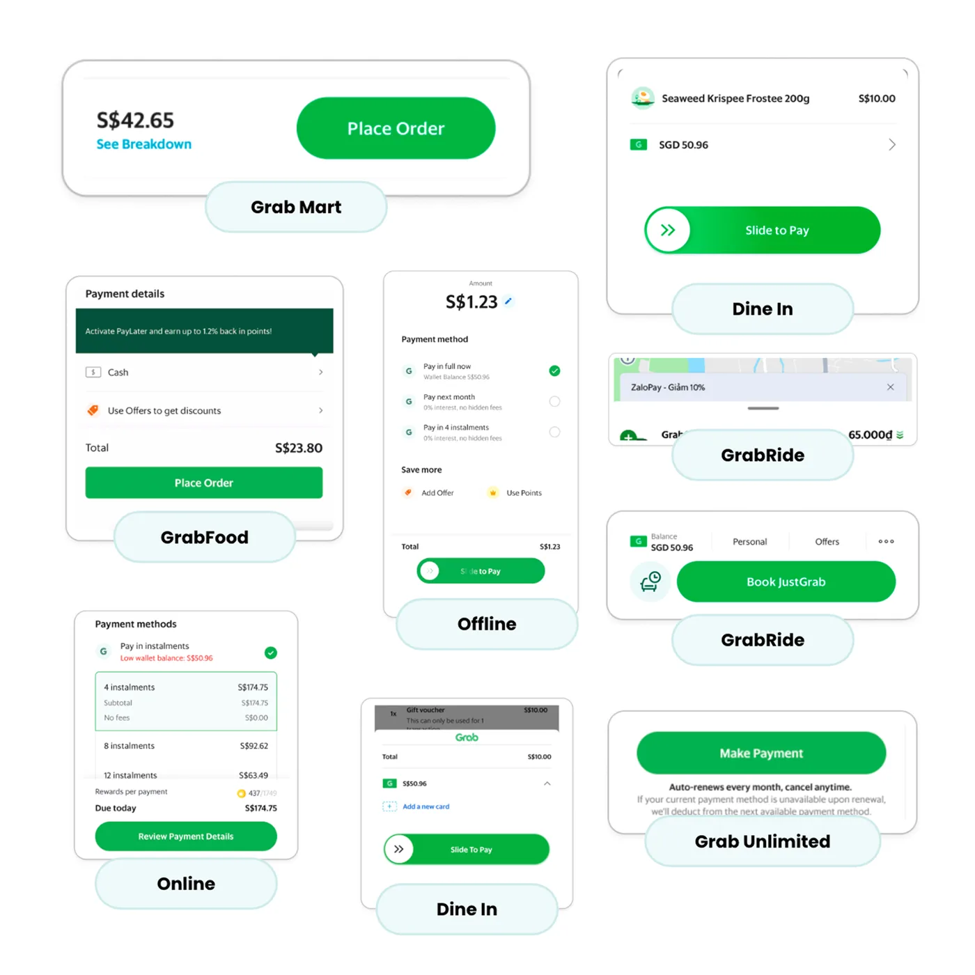
Checkout screens from Grab Mart, GrabFood, Dine In, GrabRide, Offline, Online and Grab Unlimited, each with a different layout and pay button

Where we started

Fixing the most visible issues first

We had already started improving payment experiences, prioritizing the most visible and frequently encountered issues, such as error handling and payment method lists.

  • Unified errors

    One error framework so every Grab service explains failed payments the same way and suggests a fix.

    View the case study
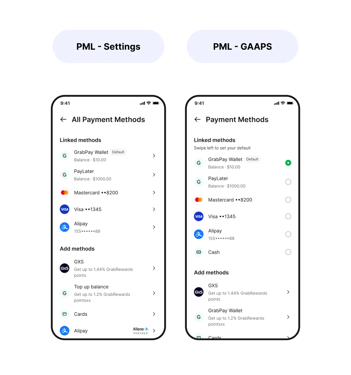
  • Two payment method list screens: All Payment Methods in Settings, and Payment Methods at checkout with linked methods and add methods

    Payment method list

    A clearer list of payment methods so users can pick and switch methods with confidence.

What was still missing

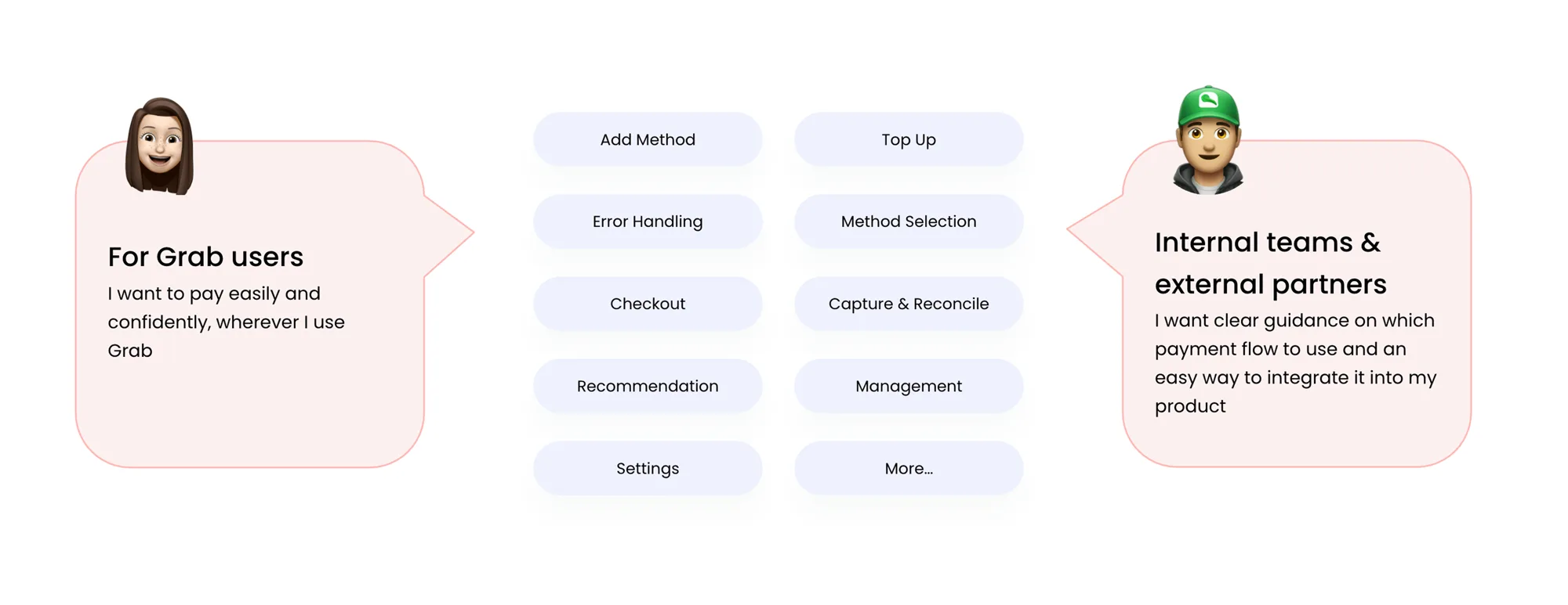
Establishing a unified framework to guide different payment flows and scenarios across Grab.

Grab users want to pay easily and confidently wherever they use Grab, while internal teams and partners want clear guidance on which payment flow to use. Between them: add method, top up, error handling, method selection, checkout, capture and reconcile, recommendation, management, settings and more

Vision

One payment experience across all of Grab

Meanwhile, Engineering was starting to unify the PaySDK infrastructure, creating an opportunity for Design to address the bigger problem and establish a scalable payment design framework.

Ensuring a smooth and unified payment experience for all Grab users and partners, enabling easy payments and transfers across channels.

I collaborated with fellow designers to define the PaySDK integration approaches and align on a shared design foundation.

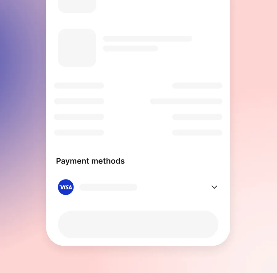
  • Prebuilt

    Fully optimised checkout flow for your app or website, with seamless payments and minimal front-end effort.

  • Checkout component embedded in a product page: a payment methods selector with Visa above the pay button

    Components

    Flexible checkout components that embed directly into your product while using GFin's capabilities.

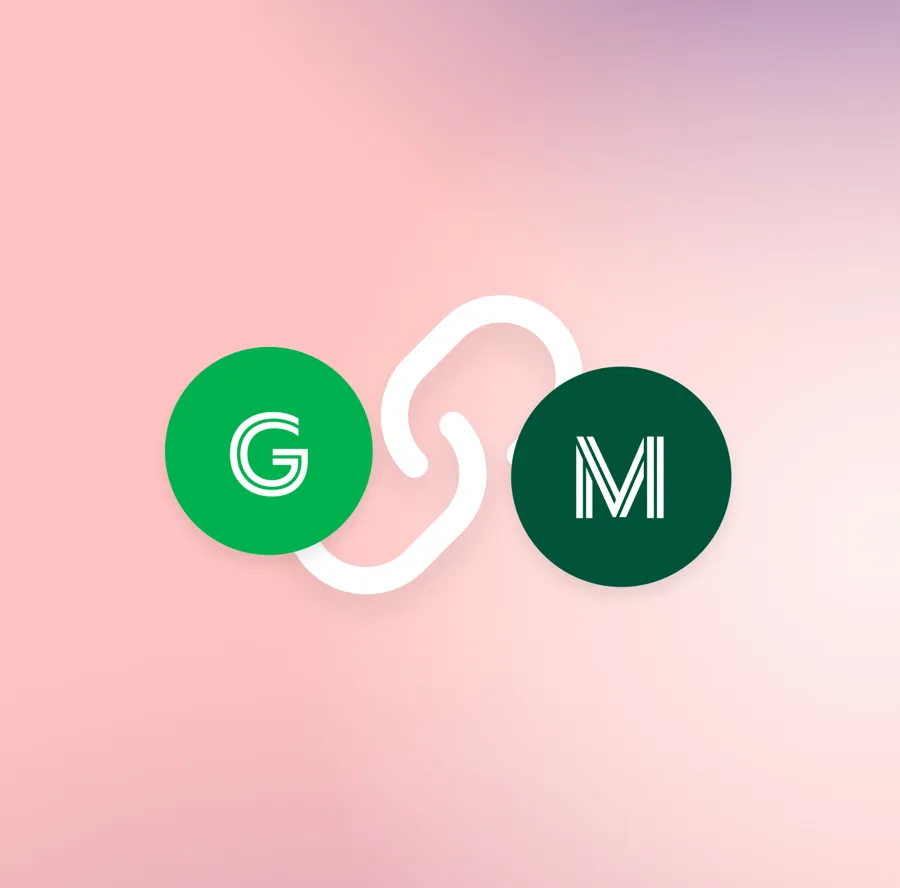
  • Grab and a merchant logo joined by a link, showing a business connecting directly to PaySDK APIs

    API only

    Lets a business build a fully customised payment flow by working directly with PaySDK backend APIs.

  • Payment Terminal

    A scalable in-person solution with UX and tech support for card tap and QR payments.

Principles

Simple, consistent and flexible

The main challenge was that different products needed different payment features, but we still wanted to provide a simple and consistent checkout experience.

So I used three principles to guide my design decisions: simplicity, consistency, and flexibility.

  1. Simplicity

    Help users complete payments quickly and confidently.

  2. Consistency

    Keep familiar payment patterns across products.

  3. Flexibility

    Support different features and business needs.

The key question was: what should remain consistent across every checkout, and what could be flexible depending on the product's needs?

To answer that question, I started by comparing existing payment flows to identify which elements were essential across different experiences.

Deep dive

Focusing on Prebuilt

Of the four integration approaches, the rest of this case study focuses on Prebuilt: a fully optimised checkout flow that product teams can drop into their app or website with minimal front-end effort. It is where the shared design foundation is applied most directly.

Information architecture

Deciding what stays the same and what can change

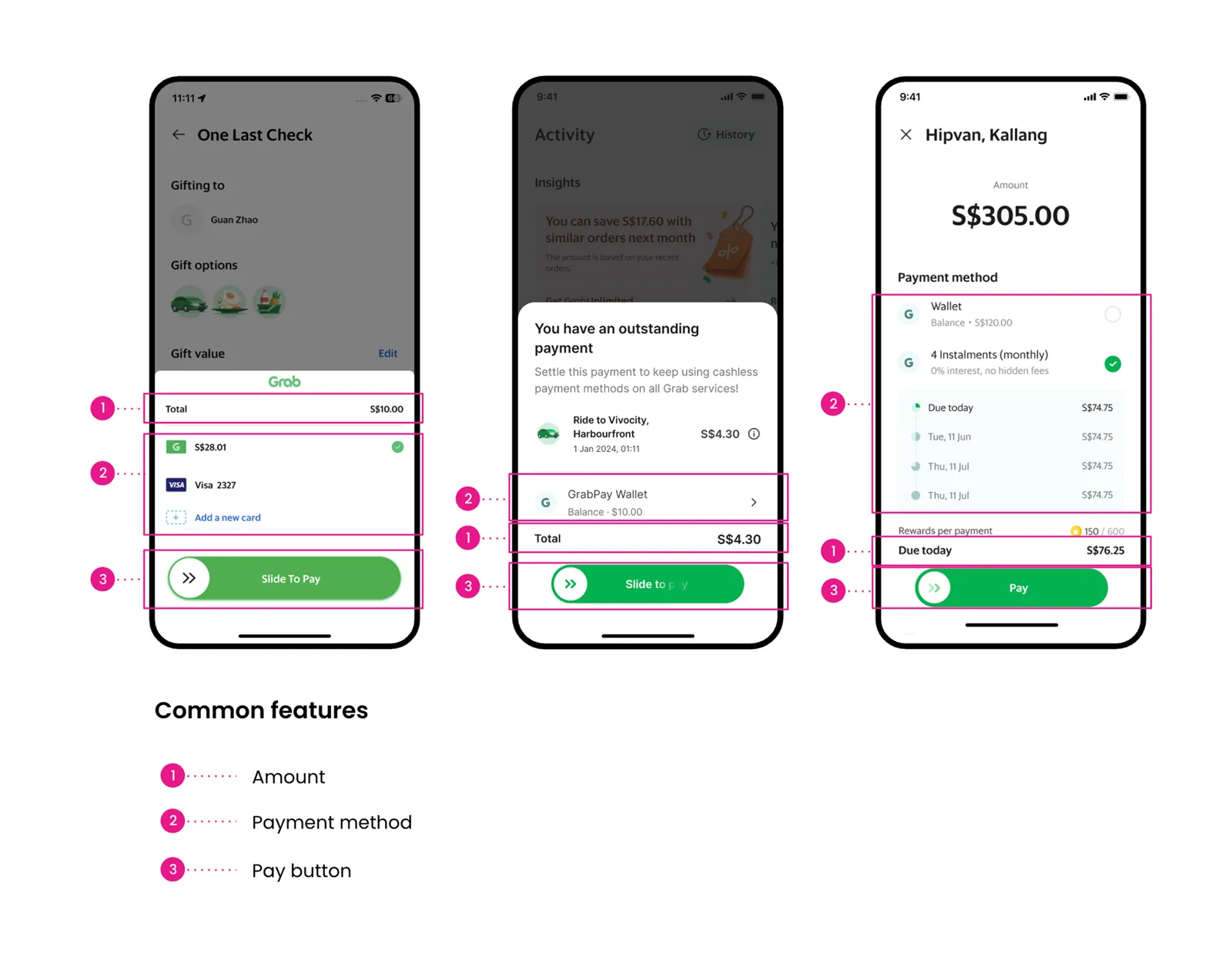
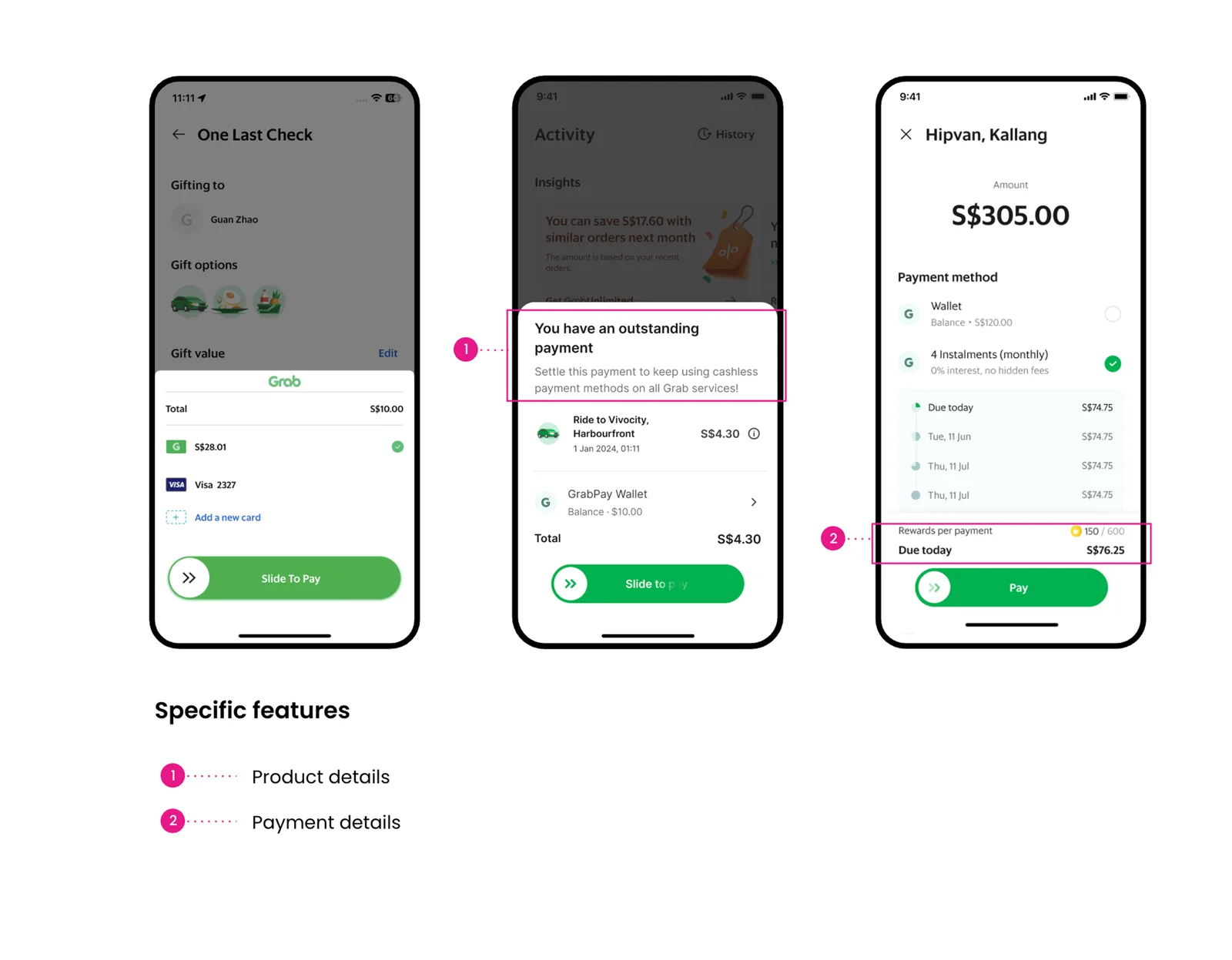
I reviewed existing checkout experiences and compared their information requirements.

Three checkout screens with the common features marked: 1 amount, 2 payment method, 3 pay button
Common features across payment flows.
The same three checkout screens with the specific features marked: 1 product details, 2 payment details
Specific features that change by product.

Establishing the foundation

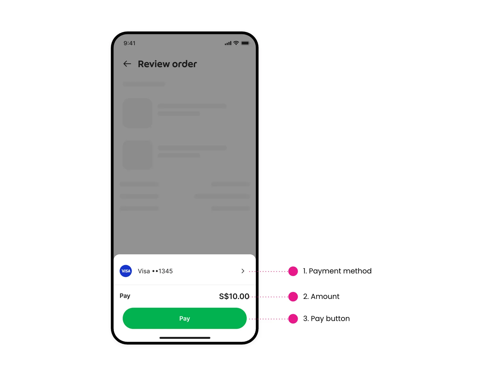
I identified three common elements around the payment decision, while other information varied depending on the use case. This helped establish what needed to remain stable.

  1. Payment method — How users pay
  2. Amount — What users pay
  3. Primary action — How users confirm payment
Review order screen with the core checkout marked: 1 payment method, 2 amount, 3 pay button
The core checkout: payment method, amount and pay button.
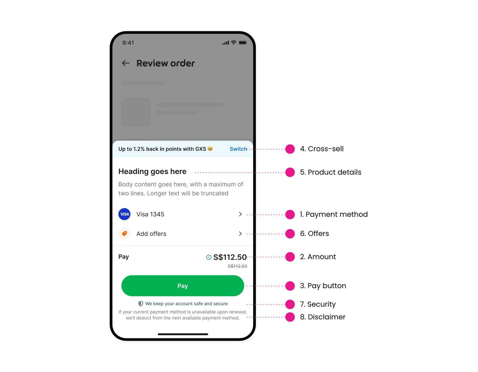
Review order screen with extra features added around the core: cross-sell, product details, offers, security and disclaimer
Where extra features like offers, cross-sell and security fit without disrupting payment.

Example of simplicity

Deciding what users need to see upfront

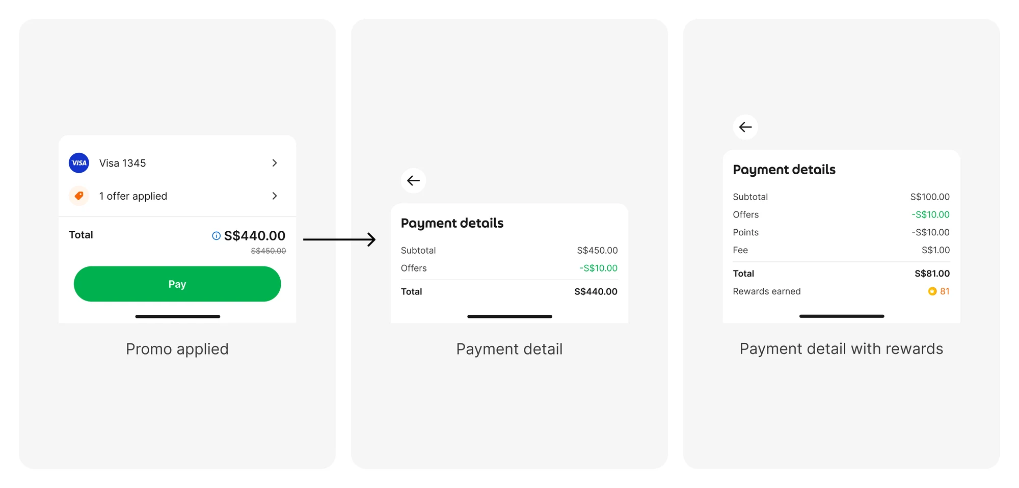
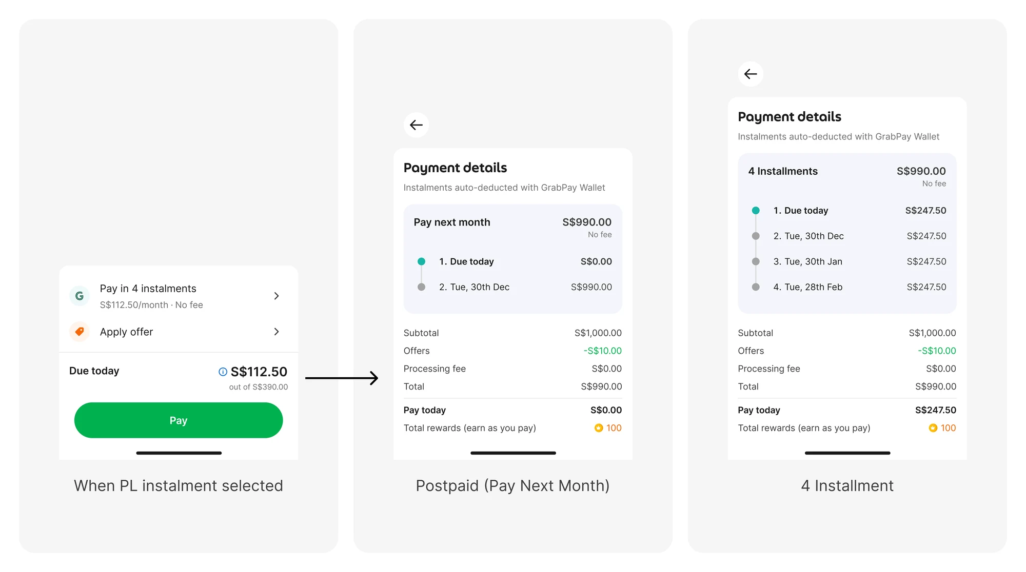
I prioritized the amount users need to pay, while keeping detailed breakdowns accessible when needed.

Default
Offer applied
When PL instalment selected

Payment details get complex depending on the use case: offers, rewards, instalments and more. Showing everything upfront would overwhelm users, so I decided to show only the most important number, what they need to pay today. The full breakdown lives on a details page for anyone who wants to understand more.

Three screens: promo applied on checkout, the payment detail breakdown, and payment detail with rewards
Three screens: checkout with a PayLater instalment selected, the Pay Next Month breakdown, and the 4 instalment breakdown

User testing

Where should the total go?

Exploring how users review and confirm payments

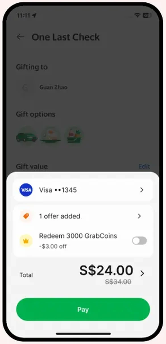
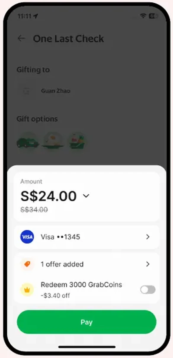
I tested two layouts with users. Option 1 placed the final amount near the payment action. Option 2 emphasised the amount at the top of the checkout.

Option 1 won. It gave us a more familiar and scalable checkout layout:

More intuitive
Familiar total placement made checkout easier to navigate.
Better promo visibility
The final total is easy to find and verify before payment.
Clear and scalable hierarchy
Keeping the total at the bottom supports additional components above it.
Option 1
Option 1 checkout, the chosen layout, with the total next to the Pay button
Option 2
Option 2 checkout: the amount shown at the top, above payment method and offers

Final design

One framework, adaptable to each product

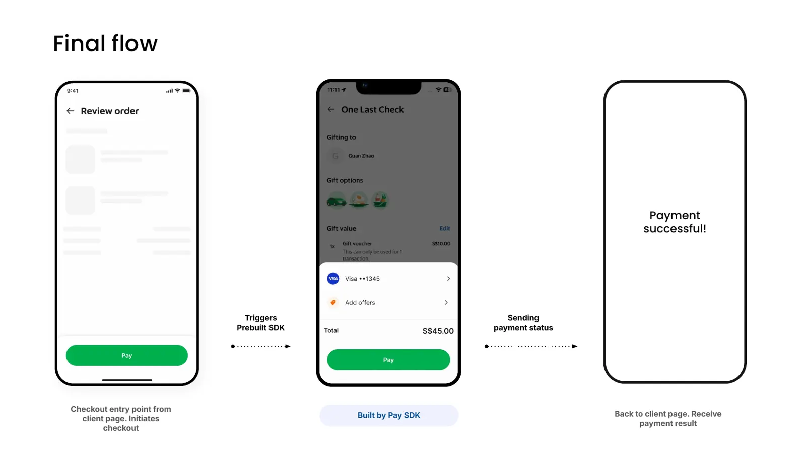
The client page starts checkout, the Prebuilt SDK handles payment, and the result goes back to the client.

Final flow.
Final flow.

The same structure adapts to different payment needs.

  • Flexible by use case: Additional payment features

    P2M integration

    Applied Prebuilt to P2M, leading the collaboration with the Lending team to address complex payment scenarios.

  • Flexible by use case: Product-specific information

    Subscription

    Added a product details component to help users review their subscription before payment, while preserving the core checkout structure.

Alignment

Bringing many teams along

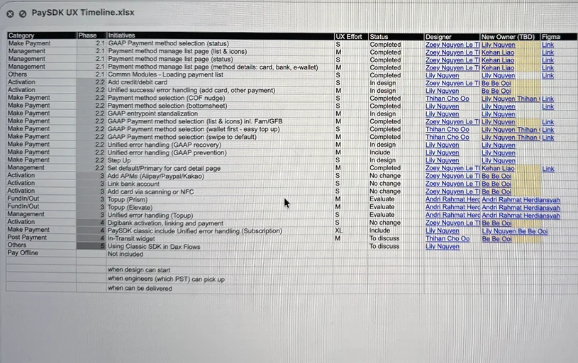
  • PaySDK UX timeline spreadsheet listing each initiative by category and phase, with UX effort, status, designer and owner

    Aligned engineering delivery

    Worked with engineering to clarify dependencies, timelines and implementation trade-offs.

  • Established design guidelines

    Defined the guideline structure and coordinated contributions across designers.

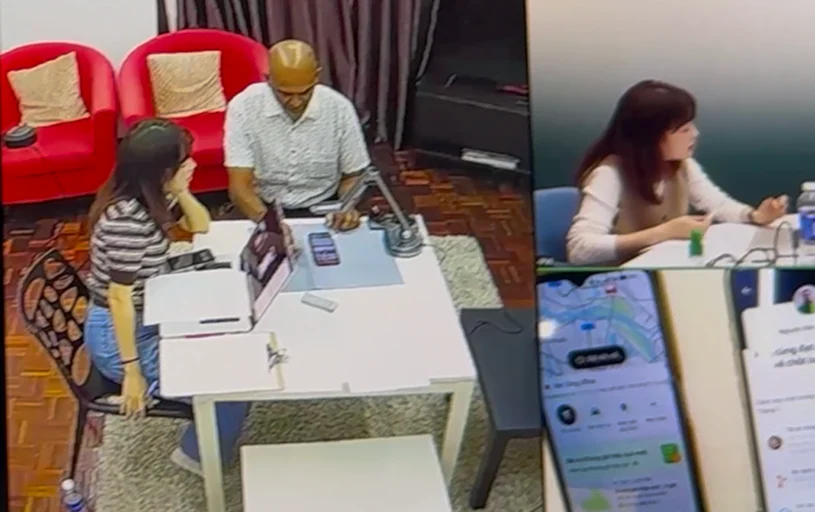
  • Usability testing session: a participant and moderator at a table with a phone prototype, with the observation room view and test screens alongside

    Coordinated research

    Worked across teams to align research planning and share findings.

Impact

Impact and reflection

What we achieved

Scalable foundation

Established a reusable checkout framework.

Team alignment

Aligned teams on shared payment principles.

My reflection

Designing at scale goes beyond reusable components.

What I learned from this project is that designing at scale isn't just about creating reusable components.

Different products have different needs, so I had to think carefully about what should stay consistent and what could be flexible.

And because many teams were involved, alignment was just as important as the design itself.